How to make a graph in excel
Creating a graph in Excel is a fundamental skill for anyone dealing with data analysis or visualization. In this step-by-step guide, we’ll walk you through the process of making a graph in Excel, from opening the software to customizing your graph for presentation. From this presentation u can come to know how to make a graph in excel.
What is a Graph in Excel?
In simple terms, a graph is a visual element that represents data in a worksheet. You will be able to analyze the data more efficiently by looking at a graph in Excel rather than numbers in a dataset. Excel covers a wide range of graphs that you can use to represent your data. Creating a graph in Excel is easy.
Step 1: Open Microsoft Excel
Launch Microsoft Excel on your computer. You can typically find it in the Microsoft Office suite or in your list of installed programs.
Step 2: Prepare Your Data
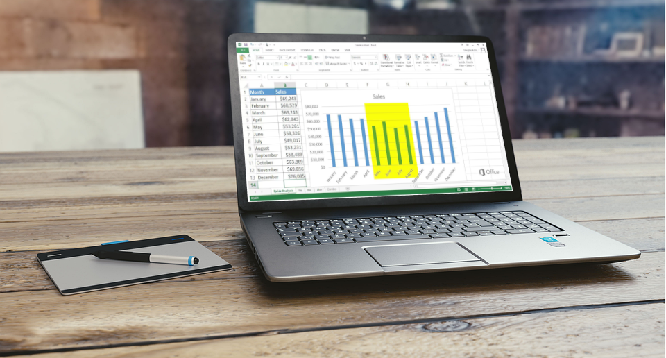
Ensure your data is organized in a table format, with each column representing a different category or variable. For example, you might have one column for months and another for sales figures.
Include appropriate column or row headers that describe your data. These headers will be used as labels in your graph.
Step 3: Select Your Data
Click and drag your mouse to select the data range you want to include in your graph. This should cover both the X-axis (horizontal) and Y-axis (vertical) data.
Step 4: Choose the Right Graph Type
Navigate to the “Insert” tab in Excel’s ribbon at the top of the window.
In the “Charts” group, you’ll find various chart types. Click on the type that best represents your data. Common types include:
-
- Column Chart: Useful for comparing data across categories.
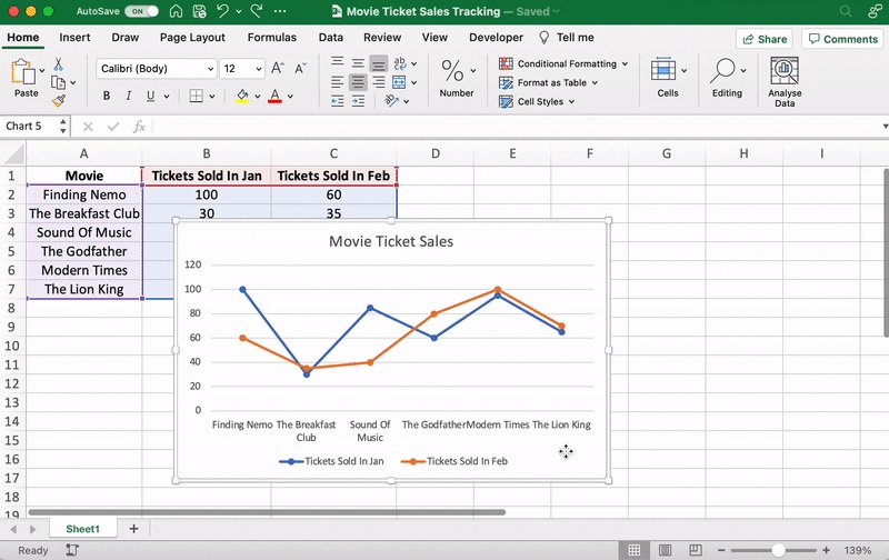
- Line Chart: Shows trends over time.A line graph is formed by connecting a series of values/data points using straight lines. A line graph can be used when you want to check whether the values are increasing or decreasing over some time.
- Pie Chart: Illustrates data as a proportion of a whole.A pie chart is nothing but a circular graph representing data in the form of a pie/circle. It is divided into different sections, each one representing a proportion of the whole.
- Bar Chart: Similar to column charts but with vertical bars.A bar graph shows information about two or more groups. Bar graphs are mainly used to make comparisons across a range.
Step 5: Insert Your Graph
Click on the chart type you want, and Excel will insert a default graph onto your worksheet.
Step 6: Customize Your Graph
To customize your graph, click on various elements of the graph and right-click to access formatting options. Here are some common customizations:
-
- Chart Title: Double-click the default title and replace it with your own.
- Axis Titles: Click on axis titles and replace them with meaningful labels.
- Data Labels: Add labels to data points for clarity.
- Colors and Styles: Change colors, fonts, and styles to match your presentation.
Step 7: Add Data Labels and Legends
If your graph doesn’t automatically include data labels or a legend, you can add them manually. Data labels provide context for each data point, and legends explain the colors or patterns used in the graph.
Step 8: Format Axis and Scale
You can adjust the scale of the axes to better represent your data. Right-click on the axis labels and choose “Format Axis” to set the minimum and maximum values.
Step 9: Insert Trendlines (For Certain Graphs)
If you’re creating a line chart or scatter plot and want to analyze trends, you can add a trendline. Right-click on a data series, select “Add Trendline,” and configure the options.
Step 10: Create Multiple-Series Graphs
To include multiple data series in one graph, select your data and chart type, then Excel will automatically distinguish the series with different colors or patterns. You can further customize these colors as needed.
Step 11: Save and Share Your Graph
To save your graph as an image or PDF, right-click on the graph and choose “Save as Picture” or “Copy.” You can then paste it into other documents or presentations.
Step 12: Update Data and Refresh Graphs
If you make changes to your data, you can refresh your graph by right-clicking on it and selecting “Refresh.” This ensures that your graph always reflects the most current information.
Creating graphs in Excel is a valuable skill for visualizing and presenting data. By following these steps and customizing your graphs to suit your needs, you can effectively communicate your data to others and make data-driven decisions.
Step 13: Choose the Right Chart Type (In-Depth)
When selecting a chart type, consider the nature of your data:
- Column Charts: Use when comparing values across different categories.
- Line Charts: Ideal for showing trends and changes over time.A line graph is formed by connecting a series of values/data points using straight lines. A line graph can be used when you want to check whether the values are increasing or decreasing over some time.
- Pie Charts: Suitable for displaying parts of a whole, such as market share.A pie chart is nothing but a circular graph representing data in the form of a pie/circle. It is divided into different sections, each one representing a proportion of the whole.
- Bar Charts: Similar to column charts but with horizontal bars.A bar graph shows information about two or more groups. Bar graphs are mainly used to make comparisons across a range.
- Scatter Plots: Helpful for identifying relationships between two sets of data.A scatter plot, also called a coordinate graph, uses dots to represent the data values for two different variables, one on each axis. This graph is used to find a pattern/ relationship between two sets of data.
- Area Charts: Depict data changes over time and emphasize the cumulative total.An area chart depicts the change of two or more data points over time. They are similar to the line charts, except the area charts are filled with color below the line. This chart is useful to visualize the area of various series relative to each other.
Explore subtypes within each chart type to find the best representation for your data. For instance, column charts can be clustered, stacked, or 3D.
Step 14: Customizing Axis Scales
To customize axis scales, right-click on the axis you want to modify and select “Format Axis.” You can set minimum and maximum values, axis labels, and scaling options.
Step 15: Adding Trendlines (In-Depth)
Trendlines are useful for analyzing data trends. When you add a trendline to a chart, you can choose from several types:
- Linear: Best for data that follows a straight-line pattern.
- Exponential: Suitable for data with rapid growth or decay.
- Logarithmic: Useful for data that experiences diminishing returns.
- Polynomial: Works well for data with curved patterns.
- Moving Average: Helps smooth out fluctuations in data.
Experiment with different trendline types to see which one fits your data best. You can also display the equation on the chart to visualize the trend mathematically.
Step 16: Working with Multiple Data Series
If your chart contains multiple data series, you can customize each series individually. Right-click on a series to access formatting options, including line styles, colors, and markers.
To add or remove data series, click on the chart, then go to “Chart Tools” in the Excel ribbon and select “Design.” Use the “Select Data” option to manage your series.
Step 17: Secondary Axes (For Combining Data with Different Units)
In some cases, you may want to combine data with different units on the same graph. You can use a secondary axis for this purpose. Right-click on a series and choose “Format Data Series.” In the “Series Options” tab, select “Secondary Axis.”
Step 18: Saving and Sharing Charts (In-Depth)
When saving your chart as an image or PDF, choose the appropriate format for your needs. Common formats include PNG, JPEG, and PDF.
For optimal quality, consider adjusting the resolution or DPI (dots per inch) when saving as an image. Higher resolutions are suitable for printing, while lower resolutions are sufficient for digital use.
Step 19: Interactive Charts (In-Depth)
Excel allows you to create interactive charts for presentations or reports. To create an interactive chart, add hyperlinks to elements within your chart, such as data points or labels. This allows viewers to click and access additional information or related content.
Step 20: Data Labels and Annotations (Enhancing Clarity)
Data labels and annotations can provide context to your chart. Add labels to data points to make them easier to interpret, and use annotations to highlight key insights or trends.
Step 21: Data Validation (Ensuring Accuracy)
Before creating your chart, double-check your data for accuracy and completeness. Inaccurate data can lead to misleading or incorrect visualizations.
By following these additional tips and in-depth steps, you can create, customize, and present Excel charts with precision and clarity, making them a powerful tool for data analysis and communication.
Step 31: Advanced Data Manipulation and Pivot Charts
Excel’s PivotTables and PivotCharts are powerful tools for summarizing and visualizing large datasets. You can create dynamic charts that update automatically as you manipulate the underlying data.
To create a PivotChart, select your data, go to the “Insert” tab, and choose “PivotChart.” You can then drag and drop fields to create dynamic visualizations.
Step 32: Secondary Axis Customization (In-Depth)
When using a secondary axis, it’s essential to format it properly to avoid confusion. Customize the axis labels, units, and number formats to ensure clarity for your audience.
To prevent misinterpretation, consider labeling the chart elements (e.g., data series) that correspond to the secondary axis.
Step 33: Waterfall Charts (For Showing Incremental Changes)
Waterfall charts are excellent for displaying incremental changes in data, such as financial statements or project budgets. They show how initial values are affected by subsequent additions and subtractions.
To create a waterfall chart, you’ll often need to reformat your data and include columns for starting values, positive changes, negative changes, and the final values.
Step 34: Heat Maps (For Large Datasets)
Heat maps are particularly useful when visualizing large datasets, such as sales by region over time. They use color gradients to represent data values, making it easier to spot trends and patterns.
To create a heat map in Excel, use conditional formatting to apply color scales to your data. Cells with higher values will appear with more intense colors.
Step 35: Dynamic Labels with Formulas
You can make your chart labels dynamic by using formulas. For example, instead of manually adding labels, use formulas to pull data from your dataset or calculations.
Dynamic labels ensure that your charts update automatically when your data changes, saving you time and ensuring accuracy.
Step 36: Interactive Dashboards (Advanced)
Excel allows you to create interactive dashboards by combining various charts and slicers (interactive filters) that let users explore data dynamically.
Use PivotTables, PivotCharts, and slicers to build interactive dashboards that allow users to filter data, change chart views, and gain deeper insights.
Step 37: 3D Charts and Surface Plots (For Complex Data)
For complex data visualization, Excel offers 3D charts and surface plots. These are suitable for representing data with three variables or dimensions.
To create 3D charts or surface plots, select your data and choose the appropriate chart type from the “Insert” tab.
Step 38: Advanced Trendline Analysis
If you’re using trendlines for in-depth analysis, consider exploring advanced features like custom trendlines and forecasting.
Excel allows you to add custom equations to trendlines, providing greater control over how trends are calculated. You can also use the “Forecast” feature to predict future data points based on historical trends.
Step 39: Using Macros for Automation (Advanced)
For advanced users, Excel’s VBA (Visual Basic for Applications) can be employed to automate chart creation and customization. Macros can save time by executing repetitive tasks.
Create VBA scripts to generate charts, apply specific formatting, and update them automatically when new data is added.
Step 40: Continuous Learning and Experimentation
Excel’s graphing capabilities are extensive, and new features are added regularly. Stay updated with Excel’s latest versions and explore online resources and tutorials to discover advanced charting techniques.
Experiment with various chart combinations, styles, and features to find the best visual representation for your specific datasets and analytical needs.
By incorporating these advanced techniques and strategies, you can harness the full power of Excel’s graphing capabilities to create sophisticated, insightful, and visually appealing data visualizations that drive decision-making and enhance your data analysis capabilities.